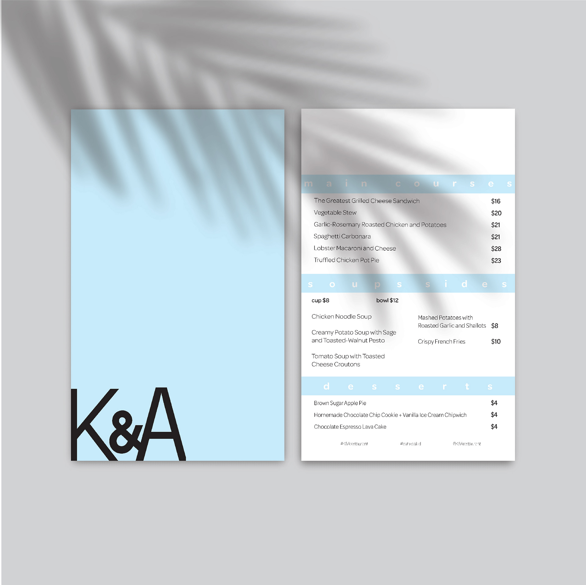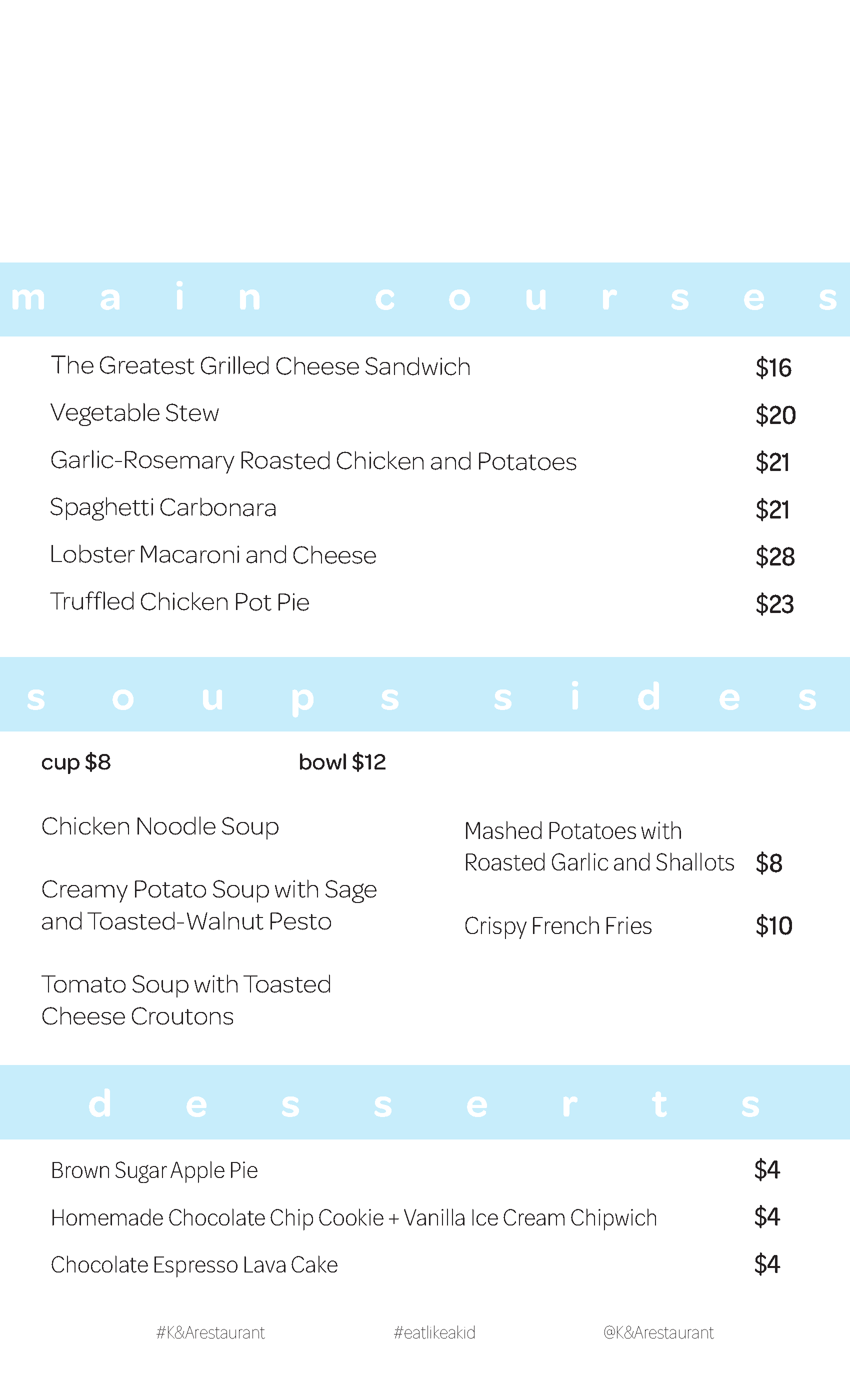
K&A Menu
‘K&A Menu’ project, the menu was created to be minimalistic, and modern. With the restaurant intended to make adults their childhood classics, the design was meant to bring a playful side with a touch of modern. The blue accent colour was chosen because it resembles relaxation and calmness. The Omnes font family is very light and airy as it is
rounded and not harsh to the eye. Having the titles of the different sections of the menu acting as whitespace makes the overall look of the menu very
open and light.
The back of the menu is very simple with just the blue background and the logo. The logo is placed in the bottom left corner to keep the back visually appealing.